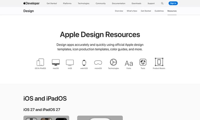
Apple Design Resources
Official Apple design templates, UI kits, fonts, and tools
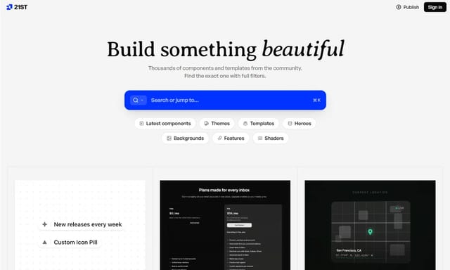
21st.dev
Hand-crafted React components and templates — not AI slop

Flareum
Design system builder that syncs Figma and code
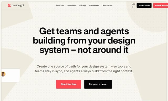
Zeroheight
Living design system documentation — connect Figma to code with interactive docs
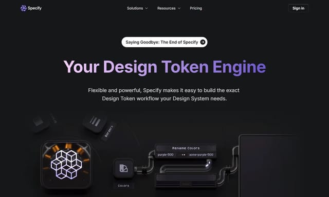
Specify
Design token platform that pushes your design decisions to code — automatically
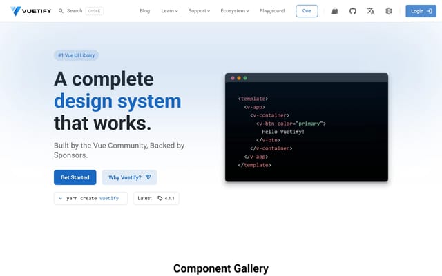
Vuetify
Vuetify is a complete Vue.js UI framework that strictly adheres to Material Design guidelines, offering a rich set of components and powerful customization capabilities.
A2UI
open-source protocol for AI agents to generate secure, declarative UIs across platforms.
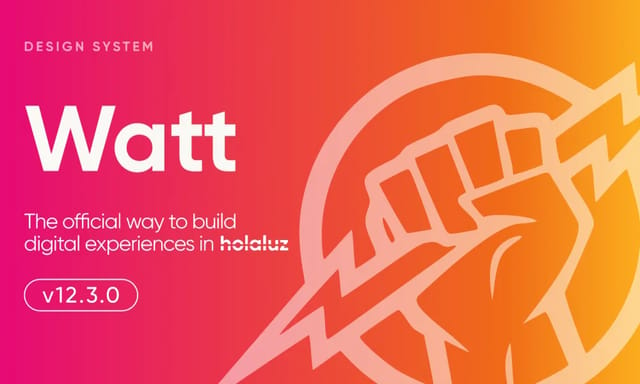
Watt Design System
Holaluz's Figma-based UI kit for consistent, accessible renewable energy interfaces.
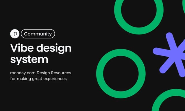
Vibe Design System
monday.com's open-source design system for consistent, accessible work management interfaces.
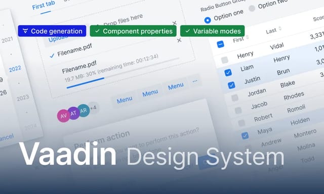
Vaadin Design System
open-source framework for consistent, accessible enterprise web apps with web components.

VTEX Design System
open-source framework for consistent, accessible e-commerce interfaces.
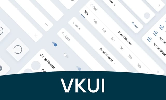
VKUI
VK's open-source React library for consistent, accessible interfaces in VK apps and services.