Chakra UI
Chakra UI is a simple, modular, and accessible React UI component library, focused on enhancing developer experience and providing highly customizable building blocks.
Product Overview
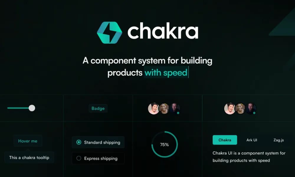
Chakra UI offers a set of simple, composable React UI components designed to help developers quickly build user interfaces. Its components are designed to be modular, easy to understand and use. Emphasizing Accessibility Chakra UI places accessibility as one of its core design principles. All components adhere to WAI-ARIA standards, with built-in keyboard navigation, focus management, and appropriate ARIA attributes, ensuring a good experience for users of assistive technologies. Highly Customizable The library provides powerful styling customization capabilities. It is based on Styled System, allowing users to pass CSS styles directly via props or configure global and local customizations through themes. Developers can easily modify component colors, spacing, fonts, sizes, etc. Out-of-the-Box Dark Mode Chakra UI comes with excellent out-of-the-box support for Dark Mode, enabling easy switching of application color themes without additional configuration, adapting to user preferences. Flexible Layout Components Chakra UI provides a range of flexible layout components, such as Box and Flex, which serve as foundational building blocks to help developers quickly construct complex layout structures. Powerful Theming Capabilities Beyond style customization, Chakra UI's theming functionality allows developers to define and extend their own design systems. Color modes, breakpoints, typography, and default component styles can all be customized. Easy to Learn and Use Chakra UI's API is intuitively designed, and its documentation is clear. Coupled with its emphasis on developer experience, it offers a gentle learning curve, allowing developers to get started quickly. Components inherently possess responsive capabilities. Users can easily define style behaviors for different screen sizes using array or object syntax in props.
Best For
Chakra UI's API is intuitively designed, and its documentation is clear. Coupled with its emphasis on developer experience, it offers a gentle learning curve, allowing developers to get started quickly. Automated Responsive Design Components inherently possess responsive capabilities. Users can easily define style behaviors for different screen sizes using array or object syntax in `props`.
Key Features
- Comprehensive component library
- Design tokens
- Documentation included
- Theme customization
Pros
- +Wide font selection
- +Color palette generation
- +Export to CSS/design tools
- +Accessibility contrast checking
Cons
- -Adoption requires team alignment
- -Customization can be complex
/// SPECS
- Pricing:Free
Nuxt UI
Nuxt UI is an open-source UI component library designed for Nuxt 3 applications, offering beautiful, customizable, and accessible Vue components.

MUI
MUI is a UI component library specifically designed for React applications. It provides a vast array of ready-to-use React components for building user interfaces, following React's declarative programming paradigm.

Tailwind UI Blocks
Tailwind UI Blocks offer pre-built UI components and layouts based on Tailwind CSS, accelerating your web development for beautiful and responsive designs.
Vuetify
Vuetify is a complete Vue.js UI framework that strictly adheres to Material Design guidelines, offering a rich set of components and powerful customization capabilities.
shadcn/ui
shadcn/ui is a unique collection of composable React UI components, offering copy-and-paste code that is highly customizable and seamlessly integrates with Tailwind CSS.
Ant Design
Ant Design is an enterprise-level UI design language and React component library, providing high-quality UI solutions to help build elegant and efficient enterprise products.

Hero UI
Beautiful, fast and modern React UI library for building accessible and customizable web applications.

Naive UI
Naive UI is a Vue 3 component library recommended by Evan You, offering beautiful, high-performance, and highly customizable components, entirely written in TypeScript.
Element Plus
Element Plus is a desktop UI component library designed for Vue 3, offering rich, elegant enterprise-grade components to efficiently build management systems.