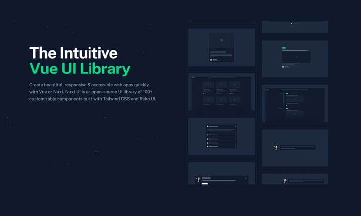
Nuxt UI is a UI component library developed natively for the Nuxt 3 framework. It fully leverages Nuxt 3's features, providing components that seamlessly integrate with the Nuxt ecosystem.
Rich UI Components
The library includes a comprehensive set of pre-built UI components, covering a wide range from basic elements (like buttons, input fields, select boxes) to more complex components (like modals, notifications, accordions, tabs, data tables), meeting daily development needs.
Theming and Customization
Nuxt UI offers powerful theming capabilities. Users can customize the look and feel of components by modifying their Tailwind CSS configuration or through presets, aligning them with brand styles. It includes built-in Dark Mode support.
Accessibility
All components are meticulously designed to ensure a high level of accessibility. They follow WAI-ARIA best practices, providing keyboard navigation support, proper semantic HTML structure, and focus management, allowing users of assistive technologies to access them smoothly.
Zero-Config
Nuxt UI strives to provide a "zero-config" development experience. Integrating and using components is typically straightforward, without complex setup steps.
Based on Vue and Headless UI
Under the hood, components utilize Vue.js and the Headless UI library. Headless UI provides unstyled, fully accessible UI logic, and Nuxt UI builds upon this by adding default styles and themes, allowing developers to get beautiful, out-of-the-box components while maintaining high customizability.
Responsive Design
All components come with built-in responsive design, automatically adapting to different screen sizes to ensure a good user experience on desktops, tablets, and mobile devices.
Icon Support
Nuxt UI offers integration with the @nuxt/ui-icons module, making it easy to use thousands of customizable icons.


