Product Overview
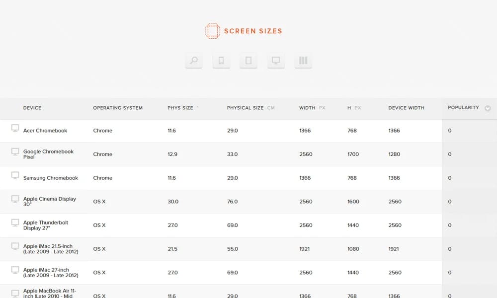
Screensiz.es is a comprehensive reference website that catalogs screen sizes, viewport dimensions, and pixel densities for popular devices including phones, tablets, laptops, and monitors. It helps designers and developers make informed decisions about responsive design breakpoints, image sizes, and layout specifications across Apple, Samsung, Google, Microsoft, and other device ecosystems.
Best For
Best for web and mobile designers needing accurate device screen specifications for responsive design
Key Features
- Complete device screen size database
- Viewport dimensions for all devices
- Pixel density information
- Physical screen size measurements
- Aspect ratio data
- Search and filter by brand/type
- Responsive design reference
- Up-to-date device listings
Pros
- +Comprehensive device database
- +Free and easy to use
- +No account required
- +Useful for responsive design
- +Regularly updated
Cons
- -Reference only, no tools
- -No API access
- -Design could be modernized
- -No comparison features
/// SPECS
- Pricing:ProFree
- Platform:Web
- Free reference website

UI Notes
Curated library of real app UI screenshots

Sky Office
Virtual design office for remote creative teams

Meiye Works
Chinese online portfolio platform for designers

GitHub.cards
Generate beautiful GitHub profile data cards

LOGGGOS
Curated logo design inspiration gallery

Viewport UI
UI curated experiences for your inspiration
Inspora
Curated archive of recent visual design and creative work

Name That UI
The visual dictionary for UI and product designers

Posts.design
A curated gallery of real social media posts for design inspiration

Pure
A clean inspiration gallery of beautiful landing pages