shadcn/ui
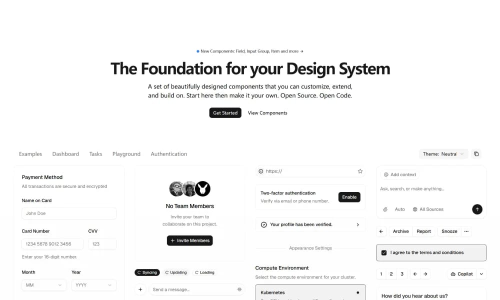
shadcn/ui is a unique collection of composable React UI components, offering copy-and-paste code that is highly customizable and seamlessly integrates with Tailwind CSS.
Product Overview
Since the component code resides directly in your project, you are free to modify and extend any part according to your project's needs. Whether changing styles, adjusting logic, or adding new features, it offers immense flexibility. The use of Tailwind CSS also makes style customization incredibly simple and powerful.
Best For
Teams building scalable, consistent digital products.
Key Features
- Comprehensive component library
- Design tokens
- Documentation included
- Theme customization
Pros
- +Free to use
- +Comprehensive design system
- +Streamlines workflow
Cons
- -Adoption requires team alignment
- -Customization can be complex
/// SPECS
- Pricing:Free
Lander Studio Blocks
Free Figma UI block library — copy and paste components directly into your designs
Animate UI
Animate UI is a free open-source React component library with Tailwind and Framer Motion animations, inspired by shadcn/ui, to effortlessly elevate web interfaces.
Vuetify
Vuetify is a complete Vue.js UI framework that strictly adheres to Material Design guidelines, offering a rich set of components and powerful customization capabilities.
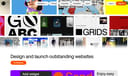
Readymag
Design stunning web publications, portfolios, and landing pages — no coding required

Chakra UI
Chakra UI is a simple, modular, and accessible React UI component library, focused on enhancing developer experience and providing highly customizable building blocks.
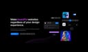
Hero UI
Beautiful, fast and modern React UI library for building accessible and customizable web applications.
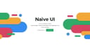
Naive UI
Naive UI is a Vue 3 component library recommended by Evan You, offering beautiful, high-performance, and highly customizable components, entirely written in TypeScript.
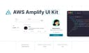
AWS Amplify
Figma components for building Amplify-powered apps with consistent AWS design language.
Airtable UI Kit
Figma components for designing Airtable-integrated apps with consistent UI patterns.
Flowbite Design System
open-source Tailwind CSS component library with Figma kit for rapid UI building.
21st.dev
Hand-crafted React components and templates — not AI slop
Apple Design Resources
Official Apple design templates, UI kits, fonts, and tools

Animalia DS
comprehensive design system for consistent UI components and guidelines in Animali apps.

Wix Design System
comprehensive Figma library of UI components and guidelines for consistent Wix app designs.
Element Plus
Element Plus is a desktop UI component library designed for Vue 3, offering rich, elegant enterprise-grade components to efficiently build management systems.